A poster-style infographic map for newcomer students.
Commissioned by
Hogeschool van Amsterdam
Tools
Figma, Adobe Draw, Procreate
Specialism
Information design, Visual design, Infographics
Date
Oct 2020 — Nov 2020
Designing a map of the Amstelcampus
During my semester of information design, I followed a course related to infographics. Basically, it was all about explaining things simply by visualizing information in different ways.
As for the assignment, we had to design an infographic that shows the direction the person needs to follow along with the given task that they need to execute. The instructions need to be shown visually, step by step, and of course, need to be understandable for the person to follow. There were no other restrictions when it came to the style of the infographic or the whole idea, so everything was possible. I went for the idea of designing a map for new students to get a little more familiar with the place and its surroundings.
The visual instructions
Starting with the instructions, it was pretty clear that everyone had to implement this into their map. It consists of a trail that you need to perform on an apparatus. We went to the playground and we had to take pictures from a specific angle that fits the corresponding step.
I drew the steps by tracing them in Adobe Draw to make them digital. This was the first step of designing the infographic.

Choosing an art style
Based on the fact that we’re designing a map, I thought it would be a good idea to choose a style that contains ‘depth’ to let the visual hierarchy shine. It also needed to be a style that I enjoy working with. Therefore, I did my research by looking for some maps that I want to implement in my own. I created some mood boards regarding the general art style, types of maps, and pictograms. This gave me the idea to work with isometrics. It seemed really fun and I wanted to take the challenge since I haven’t tried something like this in a project.
Mood boards

General art style

Different kind of maps

Pictograms
The design process
Working on the map
For the map, I worked in Procreate to get this 3d isometric feeling.
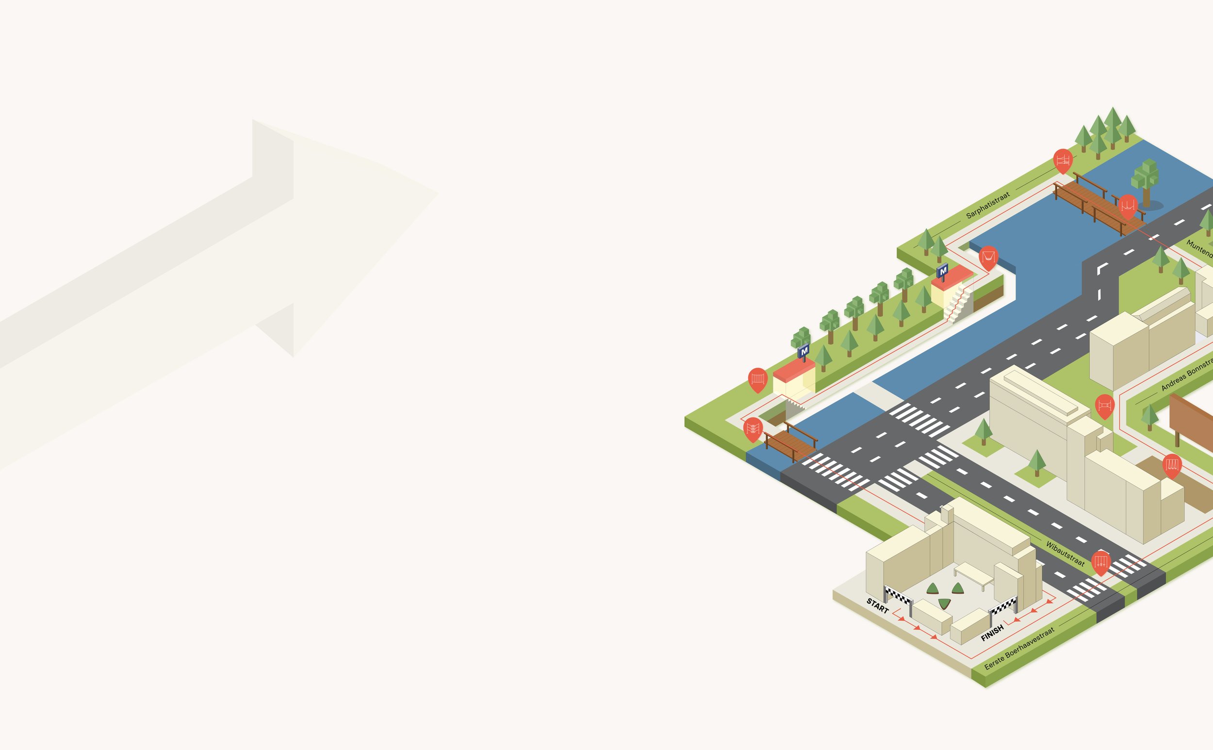
At first, I didn’t know where to start, because I had to get the proportions right. Since my idea of the map was based on a route around the school campus (Amstelcampus) for the new students, I chose to highlight the different school buildings on the map to point out the different locations of the apparatus they had to go to. I think this really worked well for me to design the map as a whole.

V1

V2

V3 (not the final version)
Designing the pictograms
The pictograms that were required to use in the map, are to pinpoint the different apparatus, therefore the route the student has to follow. I began sketching the different pictograms and tried to turn them into something simple and recognizable. I went by the rule ‘less is more’. I was thinking about making the pictograms isometric as well but thought that it would be overkill with everything isometric, so I kept it flat, based on hierarchy reasons.


The final product
The final version of the poster contains an overview of a part of the Amstelcampus. I tried to make the place more recognizable by choosing some important places that the new students are familiar with., such as the metro station, the school buildings, and the crossovers. I went for bright colors to make it more playful and implemented the color red as the direction you need to follow.
5 weeks of hard work resulted in a poster that I’ve really enjoyed working on. Looking back, it took me quite some time to make an isometric map, but I’m glad I made that decision.
