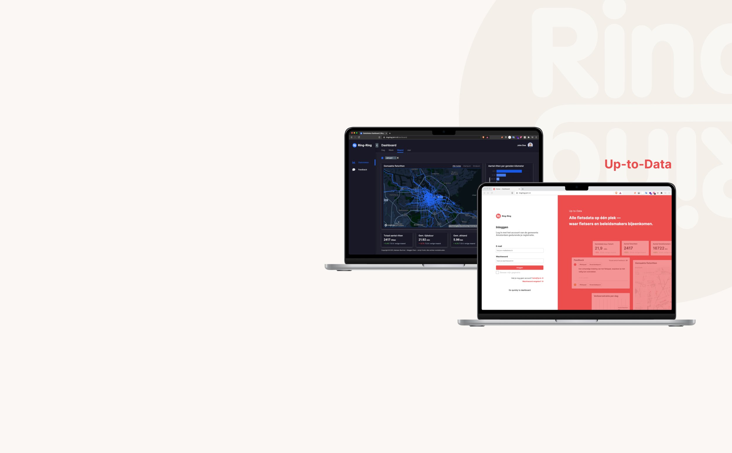
The dashboard tool for policymakers to improve bicycle safety in the traffic of Amsterdam.
Commissioned by
Ring Ring. Hogeschool van Amsterdam
Tools
Figma, Notion
Specialism
Information design, Data visualization, Web design
Date
Dec 2020 — Jan 2021
Introduction
In year 3 of my Communication & Multimedia Design study, I chose a semester focused on information design.
During this semester, I took several courses and worked on a team project for a client. This project was done in a group of 3 - together with Marleen Buchner (in charge of visual) and Jordy Fronik (in charge of tech) - within a span of 5 weeks.
I was also responsible for the visual aspect in this team for designing the screens/pages of the product.
The assignment
Our assignment was given by Janine, the owner of an organization called Ring-Ring. It’s a service that promotes the use of bicycles in the Netherlands based on health reasons. By using the related application, you can keep track of your cycling miles and redeem these at affiliated stores and local initiatives in your neighborhood.
Our mission was to design and release a digital dashboard tool for policymakers of the municipality of Amsterdam that provides insight into the road safety of cyclists within the Amsterdam inner ring. The purpose of doing this is to let the policymakers have a better understanding of the traffic and take action when needed.
Defining the problem: how can we solve it?
Problem statement
The following question that we formulated based on the assignment, helped us in the right direction of the design process:
How can you visualize multiple needs of the policymakers of the municipality of Amsterdam into a digital dashboard, to provide them insight of the traffic so that they could improve the conditions when needed?
Needs of the policymakers
It is a requirement to be able to read insights from the visualized data that is made available in the dashboard. The specific type of data visualization also depends on the bicycle dataset that Ring-Ring gave us, so the combinations are limited.
Possible issues that the policymakers would want to know more about are:
The number of bicycle trips made in the inner ring of Amsterdam
What kind of feedback is submitted by a user about the trip in combination with a filtered keyword system
General statistics about the available bicycle data
The specific bicycle trip in combination with the submitted feedback of a user
Statistics with filtering system on a period (day, month, year)
The ideation phase
Creating possible concepts and making final decisions
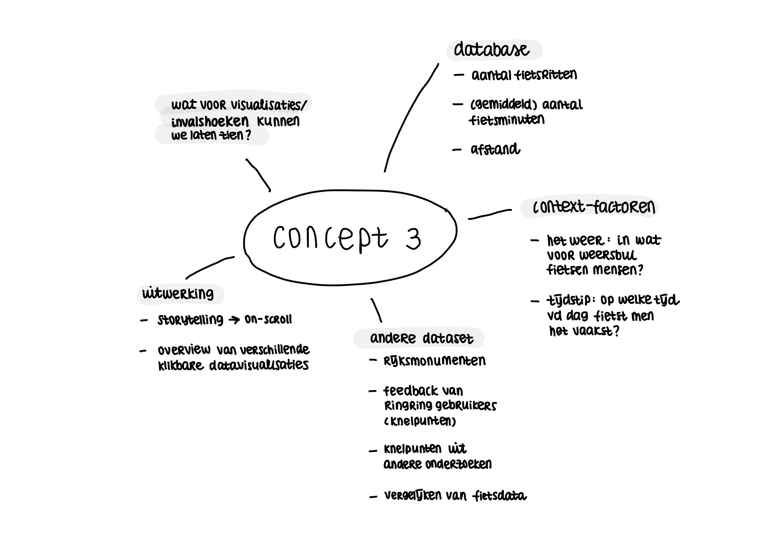
During this phase, different kinds of concepts were being made to see what might fit the needs of the policymakers. We created 3 possible concepts.
After having a conversation with our client Janine from Ring-Ring to receive some of her feedback; we decided on concept 2: a dashboard with 2 overviews: 1. general statistics and 2. feedback overview. We thought that this would be a great idea to fit into the needs of the users.


Art direction
The purpose of a dashboard is, of course, to be able to make it readable for the policymakers. In order to display the various statistics in the best possible way, we, first of all, went in search of references that we could use for inspiration for both the style and the data visualization of information. We wanted to go for a simple and clean design so it won’t be too complicated for the users.

Mood board of different kinds of dashboard designs.
The design process — iterations
Marleen and I were in charge of the design aspect of the dashboard; the look and feel of the layout and the different types of visualizations. We did this step by step to evaluate the decisions that we made. Besides, we worked with Jordy who had to translate our design into code, so the design had to be realistic enough to develop the whole dashboard.
V1 — without colour
We began experimenting with some designs where we thought would fit the needs of the user. We wanted it to be simple; they needed to understand how the website works. That’s why we ended up with multiple blocks for the layout to separate the information from the rest.
V2 — with colour
After getting approval from the client on this design, we started adding color. This was something we were still playing around with. We were pretty free in what the design looked like; there was no style we had to adhere to. We did try to combine the colors of Ring-Ring with a dark color that we wanted to add to the design.
The end result
After 5 weeks of hard work, my team and I designed Up-to-Data: a dashboard that the client was very excited about! The technical aspect of coding and putting it online was also a success.
Besides making adjustments to the data visualizations, we added a few screens to highlight the different states (404, loading screen, etc.). This was not necessary, but it was fun to make the product as complete as possible. And also a nice addition: dark mode! It works based on your system settings.
Style guide
Design choices
For an in-depth explanation of the design choices we made, you can read this handout below.